From Scratch to a Testable HMI

A blueprint for a realistic product development

Person uses a laboratory balance.

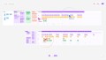
What steps are involved in bringing a product to life, from the initial idea to the prototype? We went through a complete HMI development process, including research, UX, UI, and product design, to create a blueprint for realistic product development.

  • 10

    UX-tests

  • 20

    developed variants

  • 1

    unique design language

  • 10

    UX-tests

  • 20

    developed variants

  • 1

    unique design language

The picture shows a laboratory scale with a display that shows the current value of the substances being measured.

Starting point: laboratory scale

A precision laboratory scale used in a medical setting serves as a product example. Everyone is likely familiar with the basic function of a scale. However, its use in a laboratory setting places high demands on the HMI due to the required precision and range of functions.


We mapped the process end-to-end. This means everything from personas and user journeys to the analysis of information architecture and operating logic, all the way to hardware variants, click-dummies, and tests on the physical prototype. This results in an exemplary project workflow and, at the same time, a clear understanding of when technical expertise and direct contact with users become indispensable.

Collaborative tools enabled asynchronous and simultaneous work on the project, even across different locations.

From current to target state

To demonstrate a realistic development process, we first need to clarify some fundamentals: Who uses a laboratory balance, and in what situations? What needs to work quickly, reliably, and intuitively?

Using personas and their “jobs-to-be-done”, we derived user journeys that map out the workflow. Building on this, we analyzed the HMI of an existing laboratory balance structurally and in terms of its information architecture, and formulated a clear target state: fewer levels, more logical groups, and frequently used actions located where users expect them to be.

The image shows sketches of the initial designs for the laboratory balance at various stages of the design process.
The image shows a prototype of a new laboratory scale that was developed during the design process.

Hardware that anticipates interactions

Since digital control logic and physical interaction come into direct contact in HMIs, we developed the hardware in parallel with the interface. During the ideation phase, we sketched out various design approaches, display layouts, and details, and identified the key aspects related to basic form, lighting, and control elements. This resulted in two preferred directions: a wedge shape with a backlit display, large radii, and flat control elements, as well as a technically precise approach featuring a “floating cube”, accentuated sensors, and internal LED accents. In the end, we opted for the first design, as the simpler, large-surface volumes are more hygienic and easier to clean.

Focus on the measurement process

Based on the target concept from the research phase, we first structured the interface into wireframes and brought it to life as a clickable prototype. We then developed various design approaches to determine how much information should be visible in each situation and how to ensure the measurement process remains consistently the focal point.


The UI was conceived as a guided workflow: A loaded “recipe” guides users through the weighing process and combines measurement values, instructions, and relevant contextual information without overloading the screen. A clear color scheme facilitates quick orientation, allowing users to see at a glance whether the measurement value is within the target range.
The design variants served as the basis for informed design decisions and prepared the ground for the subsequent testing.

The image shows a prototype of the scale during a weighing process. An interface that displays the measured value is already visible.
The pictures show a prototype of the scale with the interface in the dark mode.
The picture shows a prototype of the scale with the interface in the light mode.

Prototype instead of theory

Before finalizing the UI, we tested the typical user journey using a physical prototype. True to the motto: test, understand, improve. In doing so, we specifically examined conditions that make a difference in lab environments: light and dark modes, varying lighting conditions, and font sizes. The results were incorporated into the design and helped enhance readability, usability, and decision-making confidence.

The picture shows the scale with an interface.
The image shows the smartphone app, which is designed to work across multiple devices. In the app, users can open recipes and view the exact measurements required for use with a laboratory scale.

HMI doesn't end with the product display

Finally, we expanded the concept beyond the device itself. A multi-device approach allows us to support workflows wherever they are needed in everyday life—for example, by retrieving data or loading a recipe on a smartphone. In an illustrative scenario, a single weighing operation thus becomes a seamless workflow: open the recipe, set the target weight, and weigh precisely.

Meret Oppermann UX/UI Designer

  • 10

    UX-tests

  • 20

    developed variants

  • 1

    unique design language

Cases

Project idea? Get in touch!