KION Group

Design System

A person holds a tablet in his hands showing the KION Design System called “Parcel” in an application. The person is in a warehouse.

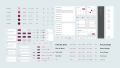
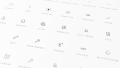
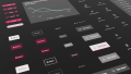
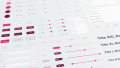
In close cooperation between the KION Group and UXMA, a comprehensive design system was created that significantly increases efficiency in product development thanks to its extensive component library, documentation and customized plug-ins.

  • 2.000+

    components in Figma and Dev Library

  • 5

    different themings

  • 2,5+

    years of successful collaboration

  • 2.000+

    components in Figma and Dev Library

  • 5

    different themings

  • 2,5+

    years of successful collaboration

In more than 100 countries, the KION Group improves the flow of materials and information in production plants, warehouses and distribution centers with its solutions. Together with UXMA, a comprehensive design system was developed, appropriately named “Parcel”. (Illustration: KION Group)

Innovative design system

In several years of cooperation with the KION Group, we have developed the comprehensive design system “Parcel”, which aims to enable the holistic and efficient development of new digital applications.

Various themes ensure adaptability to different projects and requirements. Among other things, the design system also includes a “Concept Theme”, which serves as a tool to create easily understandable and uniform screens as early as the conception phase.

Comprehensive library and documentation

The design system consists of a component library in Figma, which is regularly adapted to the latest technical possibilities.

Another component is the development library, which is based on Angular. Here, we have worked closely with the client’s developers to ensure synchronization between design and development so that the project teams can concentrate on the concepts.

In addition, extensive documentation was created in Zeroheight. This serves primarily as a central point of contact for designers and developers, but also for all other project participants such as product managers or product owners, and provides valuable assistance and guidelines for the conscientious use of the design system.

In addition, extensive documentation was created in Zeroheight. This serves primarily as a central point of contact for designers and developers, but also for all other project participants such as product managers or product owners, and provides valuable assistance and guidelines for the conscientious use of the design system.

Overview of a selection of the component library, such as colors, font sizes, buttons, switches and chips.
Close-up of the design system icons with their respective names.
Close-up of some components of the design system, for example buttons and chips, in dark mode.

Support and integration

As part of the project work, the work on the Design System is deliberately designed to be collaborative and interdisciplinary, so that we actively seek exchange with the client's other project teams – with all those who actually use the Design System on a daily basis. Our aim is to improve and complete the design system through continuous maintenance and to increase efficiency in all aspects.

Customized Figma plugins

Figma already offers a wide range of functions. However, sometimes our customers’ requirements are very individual. Here we have closed the functional gap with specially developed plugins. For example, we can offer additional quality assurance when using the design system with a plugin that checks finished UI screens for conformity with the design system.

Screenshot of the Customized Figma-Plugin.

Jan Figura Digital Designer and UXMA project manager for this project

  • 2.000+

    components in Figma and Dev Library

  • 5

    different themings

  • 2,5+

    years of successful collaboration

Cases

Ready to start something big together?