Tool-based Accessibility

The topic of accessibility is gaining in importance, not least due to the passing of the Barrier-Free Act and the deadlines anchored in it. This is a development that we at UXMA find important and right and, as a UX-driven team, we want to push it further. It is our goal to make the results of our project work in interface design equally accessible to all people. Simply put, this means proactively identifying barriers and fully comprehending influencing factors as well as the places where our interfaces are used.

Icon depicting a person with outstretched arms in a circle. A mouse cursor above it.

Example: Readability

Let's take a simple example: We usually design interfaces from 50 cm away on our computers. But what if the end users are sitting 100 cm away? Can all the content still be easily recognised? And what if the demands on readability increase due to visual impairments? Such a change of perspective is essential for successful accessibility.

Our clients share our way of thinking on the subject and commission our services explicitly from the point of view of accessibility. I will explain what this looks like in concrete terms in everyday project work in the following description. My experiences relate to the task of checking the readability of texts on different types of display. It should be ensured that all elements are easily readable.

What does the norm say?

In order to understand how readability is basically defined, a look at DIN EN ISO 9241-303:2012-03 helps.  

Subchapter 5.5 Readability and legibility contains the following:

"The minimum height of Latin characters shall be 16 arc minutes; it is required that the system is capable of providing a character height of 20 arc minutes to 22 arc minutes."

This sounds more complicated than it actually is. The arc minute is a unit to indicate angles, where 1 degree consists of 60 arc minutes. It is therefore a question of the (visual) angle between the upper edge of the character and the lower edge of the character at which the text is perceived by the eye. But too complicated? The following illustration helps to make it clear:

Grafik eines Auges und dem berechneten Sehwinkel, je nach Abstand. Die Grafik visualisiert wie groß Buchstaben bei verschiedenen Abständen sein müssen.

According to our example, millimetre or pixel values can be calculated from the distance of 100 cm and the display resolution. Using these instead of minutes of arc makes the specifications of the standard much more practicable. Since our customer only supplied compressed pixel files in this specific example, we had no choice but to measure each text individually by hand.

Isn't there a tool for this?

As efficiency-driven people, we quickly asked ourselves whether a plug-in could not take this work off our hands by automating and thus speeding up the checks. So without further ado, we developed a plug-in for the design tool of choice, Figma. What were our concrete requirements?

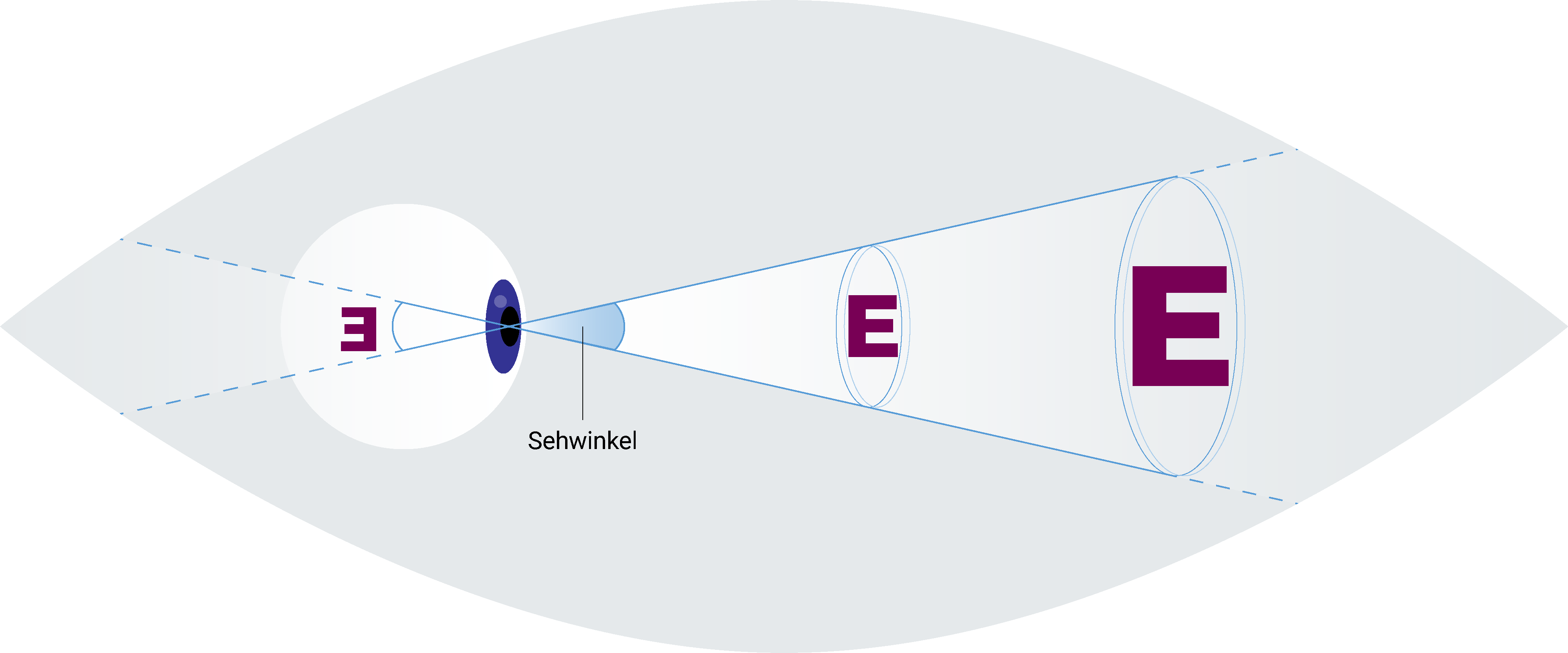
Basically, the plug-in should automatically perform the readability check on selected screens. In order to be able to calculate this on the basis of the guideline, certain basic parameters must first be checked. These include the physical size and resolution of the display as well as the distance of the user from the display.

With the help of Figma's plug-in documentation, we developed a UI that allows the input of the required data. In addition, we have enabled the use of presets. In this way, the typical distance to the display can be chosen by selecting end device types (desktop, tablet, different smartphone models).

Graphic representation of a user with various devices and the ideal distances for reading the screen content. Phone on the far right at 30cm, tablet in the middle at 40cm and desktop on the left at 80-50cm. To the left is a window from the Figma program, which shows the ISO 303:2011 Font Size Checker, with the option of setting the Screen Size and Viewing Distance.
Comparison of screen distances for different devices

Calculation and Visualisation

Through the previous work, most of the logic behind the automated analysis was ready to go. However, the ISO guideline does not refer to the font size used, but to the height of the letter “E”. Since the height of the letter “E” in relation to the font size is different for each font, we had to develop a small workaround for this. For each font and font size used, the letter “E” is converted into an outline. The height of the text element is thus reduced to the actual height of the letter, which in turn corresponds to the versal height.

Graphic representation of font. The letters EXP are used to explain the capital letter height and font size. The cap height from the bottom of the capital E to the top. The font size also includes the lower length of the lowercase p and a little space beyond that.
Comparison of vertical height and font size

After the calculation, it was important to ensure an adequate presentation of the analysis results: For this purpose, we create rectangles over all text areas of the screen with the help of our plug-in. These rectangles are colored in a four-level traffic light system based on the limit values of the ISO guideline. In addition, the calculated arc minutes are also displayed for each text element. The following example illustrates the functionality:

Two cell phone screens. They both show the same interface of a map with a route marked on it. Below it is the address with the heading "Location". In addition, three numbers (55 alerted,32 arriving,0 location) are shown, which are labeled "Emergency status". At the bottom is a timer that shows the time already elapsed for the operation. In the image on the left, yellow boxes are drawn around individual areas of the interface; in the image on the right, all boxes are green.
Readability rating at 50 cm distance (left) and 30 cm distance (right)

In the screen on the right, the traffic light is green everywhere, i. e. the requirements of the standard are fully met at the relevant screen distance of 30 cm. The screen on the left shows a display distance of 50 cm. Here, the segments marked in red show that the minimum value of 16 arc minutes required by the standard is not met.

Long story short

The task of analysing the readability of texts on different screens for a client resulted in a lot of small-scale measurement work in the first step. We have used this momentum to automatically integrate the topic of accessibility into the daily work of our team.

The tool we developed for this purpose is able to reliably determine and evaluate readability based on the DIN EN ISO 9241-303:2012-03 guideline. This allows us to guarantee the readability of texts in all projects without additional tests.

The approach of simplifying the design process with self-developed tools in order to have more time for relevant, user-centred issues offers a lot of potential. This benefits important topics such as accessibility, which we thus raise the awareness of users and developers alike even more.

Sounds exciting? Please contact us for more information.

We look forward to hearing from you. Give us a call or send us an e-mail. We are also available for you face to face via video call.

UXMA

Insights

Ready to start something big together?